Construtora AlvoradaA presentation worthy of the development.
A landing page that organises features, apartment options and questions for people considering a new home.
A concept developed by Digital S&D. The company, development, testimonials and terms are fictional. The demonstration form does not send requests.
I want a landing page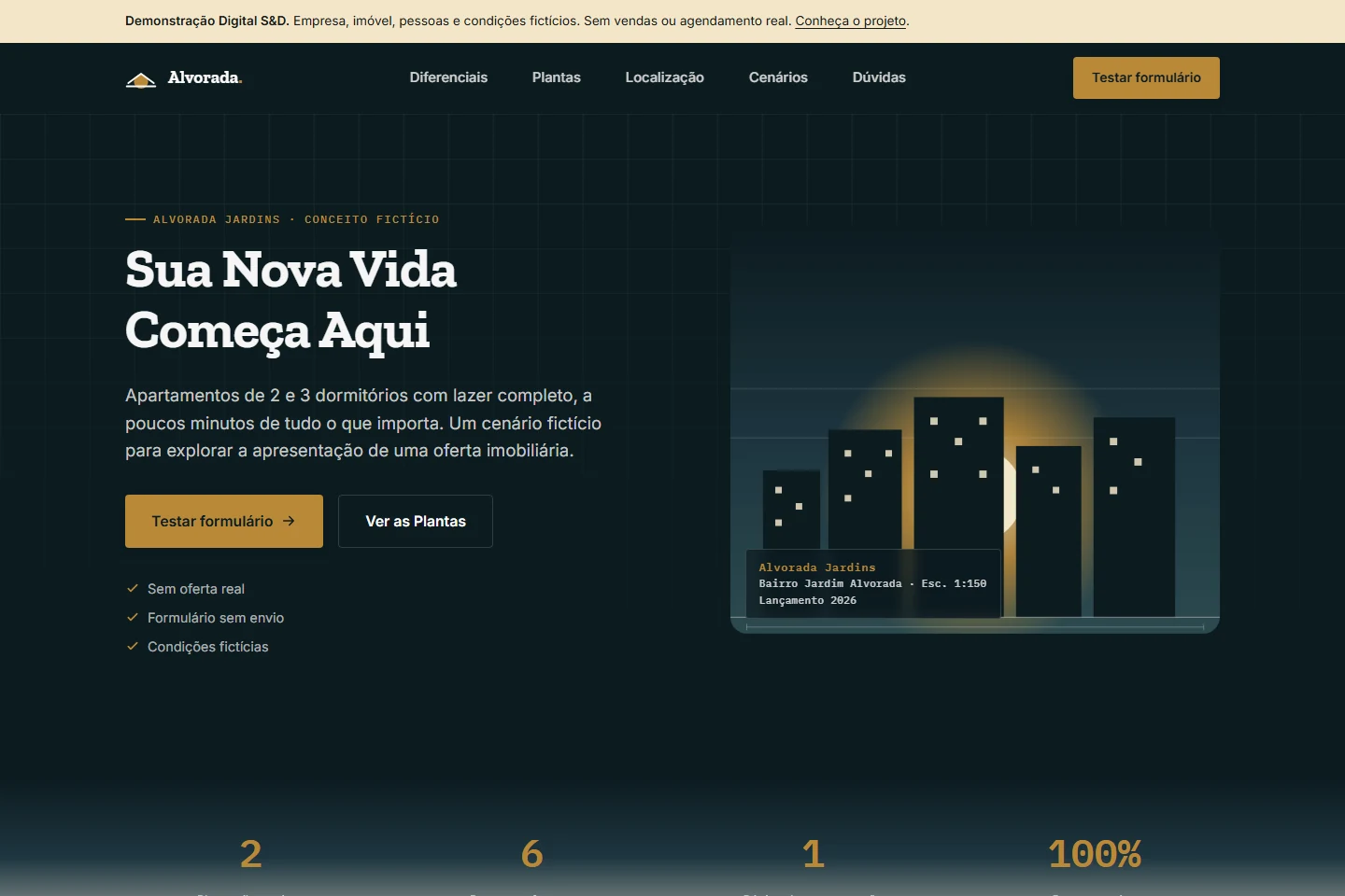
From the proposed problem to delivery.
Proposed audience: people comparing apartments and businesses that need to present a specific offer.
Proposed problem
How can one mobile-friendly page bring together features, two layouts and common questions? This is a proposed scenario, not a brief from a real campaign or client.
Contribution and responsibility
A Digital S&D team project, founded by Álvaro Marinho and Arthur Leite. Álvaro is a founder; we do not attribute the entire implementation to one person. This presentation brings together the team’s work and the checks performed on this version.
Implementation decisions
- HTML, CSS and JavaScript keep publication static, without a website build step.
- The identity uses vector illustrations, colours and lines inspired by architectural drawings.
- The comparison uses the features of the two layouts; use scenarios replace fabricated testimonials.
- Fictional-content notices and a form that sends nothing make the interaction clear to evaluate.
HTML · CSS · JavaScript
Delivery and evidence
A responsive landing page, three supporting pages, layout comparison, keyboard FAQ, mobile navigation and local validation with a test confirmation and cleared fields.
Five browser tests passed: notices and links, validation and clearing without transmission, phone/FAQ behaviour, JavaScript-disabled protection and desktop/mobile navigation. Current screenshots use 1440 and 390 px. These tests demonstrate behaviour, not increased sales.
Limits of this version
The business, property, prices and people are fictional. No connected WhatsApp, CRM, reservations or enquiry delivery. The illustration is not a tour. A real deployment needs authorised content and defined, verified channels and integrations.
The same offer, across different screens.
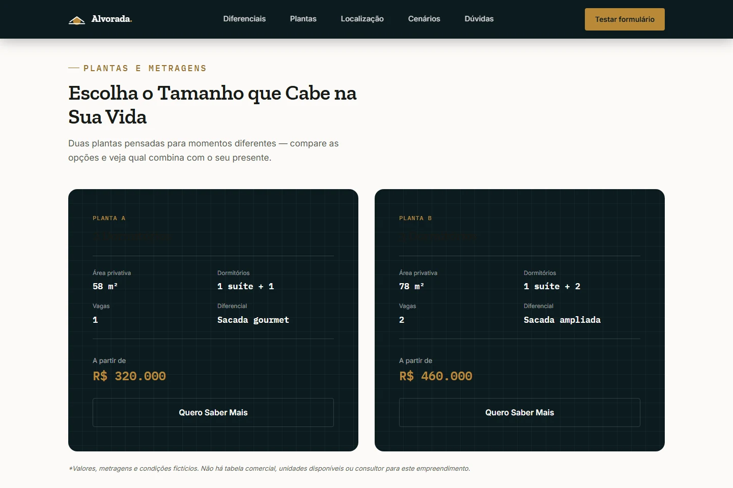
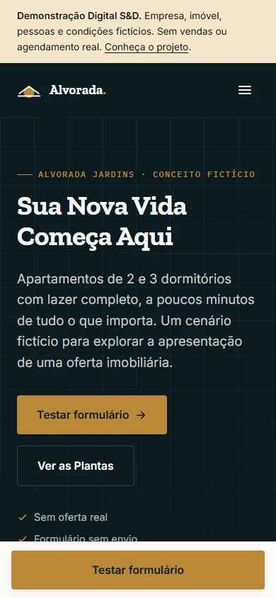
On desktop, the apartment options appear side by side. On mobile, content reorganises and the call to test the form stays within reach. These screenshots show the original project running.
From first impression to interest.
The project explores a journey for presenting a property launch: first its proposition, then the features and apartment options, followed by common questions and an invitation to contact.
Content with a clear direction.
- A visual identity inspired by architectural drawings
- Apartment sizes and features presented clearly
- Frequently asked questions organised in an accordion
- Layout adaptations for desktop and mobile
- A form with validation and simulated confirmation
Architecture in the visual language, too.
Deep blue, gold and light tones form the identity. Vector illustrations, reference lines and details inspired by technical drawings connect the presentation to construction.
The images on this page are original visual elements from the landing page. The project demonstrates a presentation concept; it does not represent sales results or a client campaign.
How will you present your next offer?
We can plan a landing page for your business, with content, visual identity and contact channels defined around the campaign.